
Unless you’ve been hiding under a rock or been on a desert retreat with no internet access, you’ve seen news about the recent changes to the slack logo. Opinions aside, what better way to celebrate the changes than to learn how to re-create it using just vanilla HTML5 and CSS3? Let’s take a dive into this fun exercise to both strengthen your web design skills, and learn a bit about logo design while you’re at it.
Setting the foundation for the new Slack logo design
To begin, we’re going to lay a foundation, or canvas, if you will, to have a nice starting point for our design. This tutorial will be shown using an online coding tool similar to JS Fiddle called Codepen (You can create a “pen” without having to sign up, and sign up is completely free).
P.S. The final code for this tutorial can be found here: https://codepen.io/SkySilk/pen/YBGRJz
Creating the foundation
Before writing any of our design code, it is common to remove all margins and padding from our document. Additionally, let’s set the box-sizing CSS property to border-box so that all padding is included in the height of any element. You can learn more about the box-sizing property here. Your CSS code should now match this:
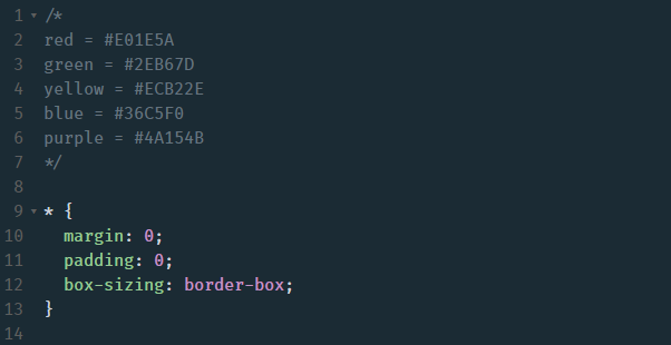
Note the commented portion up top which are simply the official colors of the new slack logo which can be found in their media kit.
The purple background
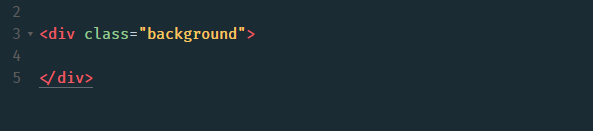
Next, let’s create some of our HTML containers which will hold our design. For purposes of this tutorial, we can simply place everything we need inside of a div. Let’s create a div and give it a class “background”. Keep in mind, these class and/or ID names can be anything you’d like.
Let’s give our HTML element some styling. First, a viewport height of 100 so that it fills the entire screen of any device you’ll view it from. We’re also going to give our background class a background-color of #4A154B (Slack purple background) and a position of relative so that we can center the container which will hold the logo.
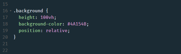
Your finished background should simply portray the purple color, extending the full viewport height.
Host your Web Application Starting at $2/m
Creating the logo container
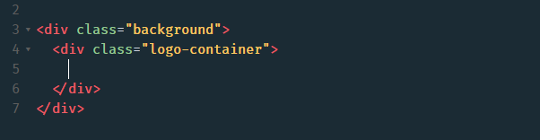
Another common convention of web development is the semantic class “container”. This is typically just, well, a container that serves the purpose of holding the content of your page. In this case, we’re going to use a container with a specified height and width to hold the logo design. To begin, create another div element inside of the background class div and assign the class of “logo-container”.
Now let’s assign some CSS properties to create the outline of our logo container.
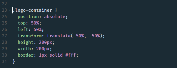
Here’s why we set our parent element to position relative – so that we can easily center our logo container. The 1px solid white border will also be a temporary measure so we can simply see the outline of the space in which the logo will live.
Setting up the logo grid
There is never a right or wrong way to do things when it comes to programming which is part of the beauty of it all. One could code each element individually and place it using transforms, or perhaps use flexbox. However, in our case, and in an effort to not repeat ourselves, we’re going to use the CSS grid system to handle this design. Add these properties to the logo-container class:
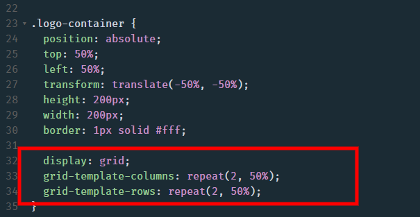
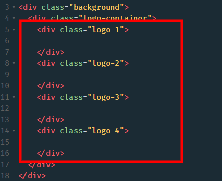
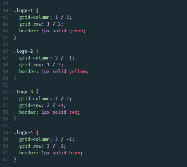
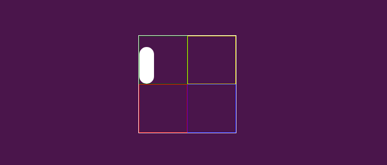
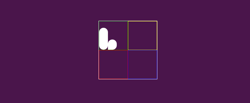
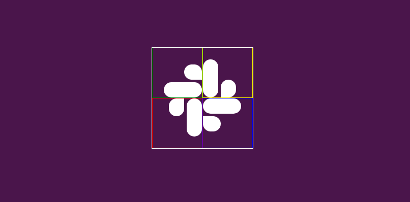
This will set up our logo container on an equal 2×2 grid. Next, create four logo elements inside of our logo-container HTML element like so.
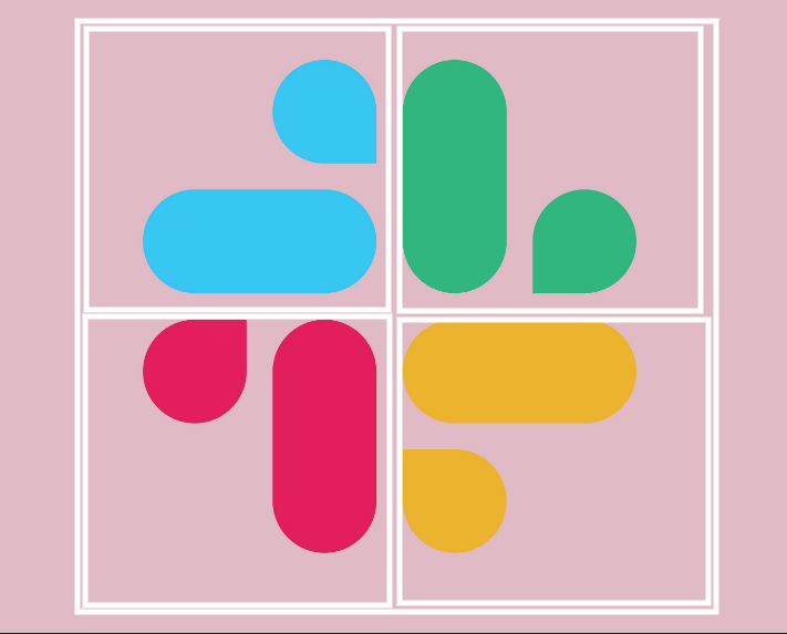
The idea here is to set up each portion of the Slack logo into its own quadrant on the logo-container grid. Here’s a visual example of how we’re going to place the elements:
Placing the logo elements on the grid
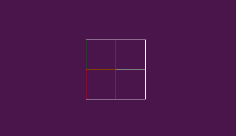
This is the final part of the design set up, promise. We’re simply going to place our four logo containers on the grid. Additionally, there are border styles to differentiate between each element, however, this part is entirely optional.
And our finished canvas:
Host your Web Application Starting at $2/m
Creating the logo elements
Let’s start by creating one quadrant of the logo. From looking at the design, it appears we’ll need 2 elements, both spaced apart and sitting at different heights. For this, some simple flexbox and positioning will do the trick.
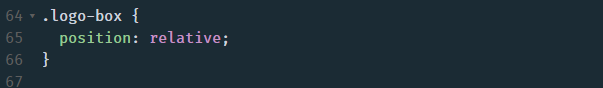
The main goal here will be to create reusable classes which we can use for each quadrant of the logo. In the end, we should simply be able to rotate each one and set its colors to put together each piece of the logo. In order to accomplish this, we’ll first add another class to each quadrant of our grid in order to set the position to relative. This will be used so that we can just rotate the 4 pieces accordingly at the end.
Notice how our logo-1 container now has another class “logo-box”. Add this to each item (logo-1, logo-2, logo-3, and logo-4) so that each container can be given the position of relative. Nothing within your canvas will change, but this will come in handy at the end of the tutorial.
And finally, “drawing” the Slack logo in CSS
Alright, so I may have been a tad overzealous when I said earlier that our setup was complete. But now, I promise we’ve reached the fun part. Let’s start to create the actual logo.
Within our logo-box containers, we’re going to create another container to hold both of the “bubbles”. This is where flexbox will come in.
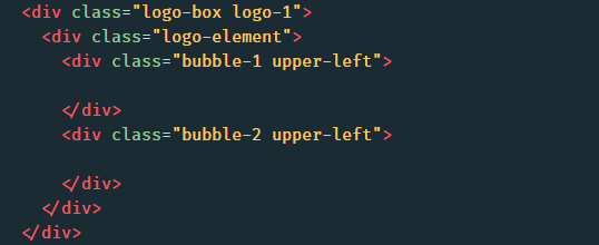
Feel free to add these elements into each logo-box container, however, it’s recommended that you focus on one quadrant for now since these classes will be reused for the remaining three. The “logo-element” div will be set to use flexbox. This is how we will align and space our logo elements. Bubble-1 and bubble-2 refer to the actual elements which will draw out the logo. And finally, the upper-left class will be used to set the colors for each piece of the logo.
The logo-element class
Here’s how your code will look for the logo-element class:
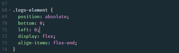
First, we set the position to absolute. This is so that the elements within this container will be positioned at absolute left and bottom. This will place the “bubble” elements in the correct spot. Next we have display: flex, which, of course, will set this container to a flex display. We are going to align the items to flex-end as well so the second bubble snaps to the bottom of our container rather than the top.
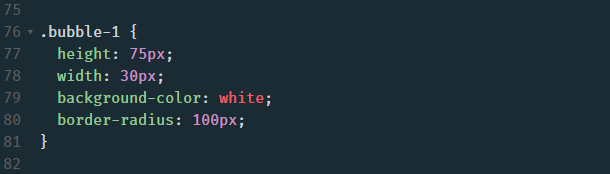
The “bubble” elements
Here’s where we begin to create the actual pieces of the new Slack logo. As a forewarning, these heights, and widths are a complete estimate and may not be proportional to the actual Slack logo.
For the “bubble-1” class, let’s assign a height of 75px, a width of 30px, and a background color of white for now (This will change in a bit). In order to get the “bubble” effect, let’s give this element a border-radius of 100px as well.
Your overall design should now look like this:
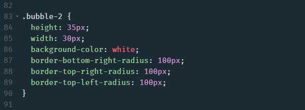
Adding the “bubble-2” element
Now we’ll create the little brother to the bubble-1 element/class. There are a few things to note about this little guy:
- It’s shorter
- The border-radius is different
- There’s some spacing in between the two elements
Let’s tackle all of this in the bubble-2 CSS class. To start, let’s make this element shorter by giving it a height of 35px, the same width as bubble-1 of 30px, and again a background color of white. To knock out the border-radius, we’re going to select each corner of bubble-2 individually and give them a radius of 100px. The overall bubble-2 class code should now read like this:
And boom, now it’s starting to feel like something is coming together, yeah? Your design will now look (well, should look) identical to this:
Now let’s space these elements accordingly. For this, we’re going to assign a margin-right to each child element within the logo-element class. This will be applied to each quadrant so there’s no need to rewrite our code. The assigned value is 5px, although feel free to play around with what feels right.
Host your Web Application Starting at $2/m
Filling out the remaining quadrants
Now that we have our basic reusable class set up, we can continue to fill out the rest of our grid. If done correctly, all that will be needed at the end is some simple rotation and coloring. Add these elements to your HTML document:
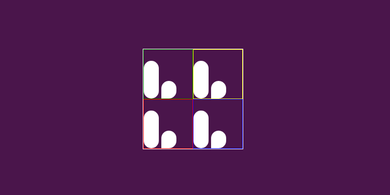
All that’s happened here is a simple copy-paste. The only difference being the “upper-right”, “lower-left”, and “lower-right” classes being assigned to the different quadrants. These will simply just be used to color the different portions of the new Slack logo. After adding in this portion of HTML code, your overall design will now look like this. And don’t worry, we’ll get rid of those ugly borders soon enough.
Finishing up the logo design with rotations and coloring
Alright, you’ve made it. You’ll finally have something to show for all of your hard work to your friends, family, and future employers. Since we’ve attempted to follow the DRY (Don’t Repeat Yourself) methodology, all we need to do now is set the rotation of each logo container. Here are the rotations specific to each quadrant:
- logo-1 – transform: rotate(-90deg);
- logo-2 – This will stay as is.
- logo-3 – transform: rotate(-180deg);
- logo-4 – transform: rotate(90deg);
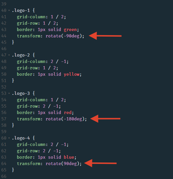
Upon applying these styles to their respective classes, your design will now look almost complete.
How to design the Slack logo in CSS: Final steps
Alright, so we’re basically done. The final steps here should be quite clear:
- Remove those god awful borders (Though helpful when positioning/designing)
- Add a grid gap so that the quadrants are spaced apart
- Color each quadrant of the logo
Let’s start with number 1. All we need to do here is simply remove the borders we added to each logo class (1-4) and the enclosing logo-container element. This leaves us with something much cleaner (oh my God we’re so close): :
:
Now let’s add that grid gap of 5px to the logo-container class so that our elements aren’t all squished together like a subway train during rush hour.
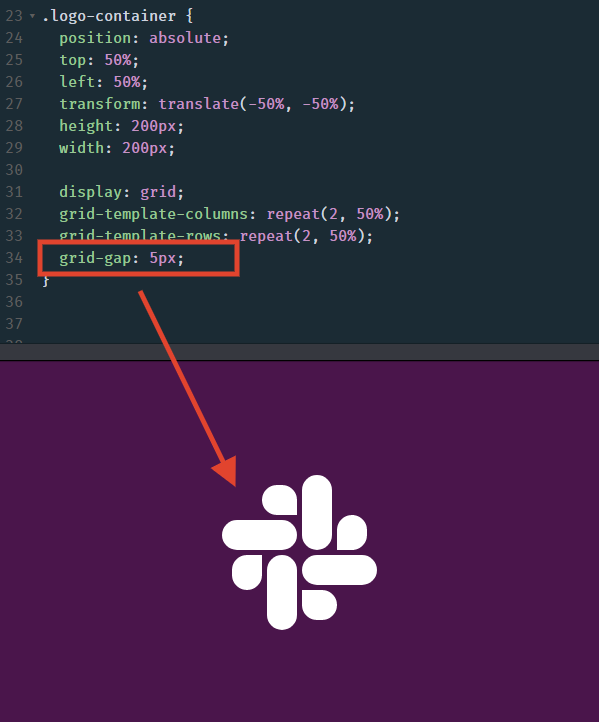
Ok wow, now I see why we went through all this trouble, this is pretty cool. Is that what you’re currently thinking to yourself? Yes? OK great, let’s continue to the final step: coloring in the quadrants.
Way up in the earlier sections of this tutorial, a screenshot is provided with the official colors for the logo. I’ll write them here again in case you’re having a case of TL;DR.
red = #E01E5A
green = #2EB67D
yellow = #ECB22E
blue = #36C5F0
purple = #4A154B
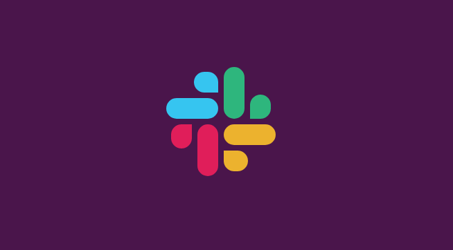
Now let’s assign these background colors to their respective classes in order to finish this thing up once and for all. The colors will be assigned as follows:
- upper-left – #36C5F0 (blue)
- upper-right – #2EB67D (green)
- lower-left – #E01E5A (red)
- lower-right – #ECB22E (yellow)
Oh, and before you add these background colors, be sure to remove the white background color from the “bubble-1” and “bubble-2” classes which we used for styling purposes.
Host your Web Application Starting at $2/m
The final design
P.S. The final code for this tutorial can be found here: https://codepen.io/SkySilk/pen/YBGRJz
And voila, you’ve successfully recreated the new Slack logo in CSS. Give yourself a nice pat on the back and go on to use what you’ve learned here to start coding/designing your own business logos and/or websites!
And something to always keep in mind as a developer; There’s never a right or wrong way to do something. You’re always welcome to play around with the margins, padding, pixels, and anything else until the design feels just right to you. If you have a more efficient way of producing this design, let us know in the comments or feel free to come and share it in our Discord server.
What else you might like:
15 Web Design Tips to Improve your Brand Awareness
Use promo code “SKY95SLACK” to save 95% off your first month. Offer is valid for new users only.


